
Gallery walls have become a staple in modern interiors. A well-designed gallery wall adds depth, personality, and visual structure to a space.
It can anchor a living room, bring life to a hallway, or add warmth to a primary bedroom. Whether you are decorating your forever home or preparing a property for sale, understanding how to design a gallery wall properly will elevate the entire home.
This guide breaks down how to approach gallery walls with clarity, structure, and intention.
Start With the Wall, Not the Art on It
Before choosing frames or prints, evaluate the space. The size of the wall, ceiling height, furniture placement, and natural light all influence the layout.
If it’s above a sofa or console table, your gallery wall should typically span about two thirds of the furniture width. If it is too small, it can look disconnected. If it is too wide, it can feel overwhelming. In staircases, artwork should follow the angle of the stairs with consistent spacing, so the arrangement is aligned without chaos.
Take some measurements first and map the layout on the floor or use a digital tool to visualize proportions. Planning the structure first saves unnecessary holes in the wall and ensures balance from the beginning.
Choose a Clear Design Direction
Strong gallery walls have cohesion. That does not mean every frame must match, but there should be a unifying element such as color, subject matter, or frame style.
Here are three reliable layout styles that work in most homes:
1. Structured Grid Layout

A grid layout uses identical frames arranged evenly in rows and columns. This style feels clean and architectural, making it ideal for modern or transitional homes. It works especially well with black and white photography, abstract prints, or minimal artwork.
Grids are also effective in-home offices and dining rooms where symmetry enhances focus and structure.
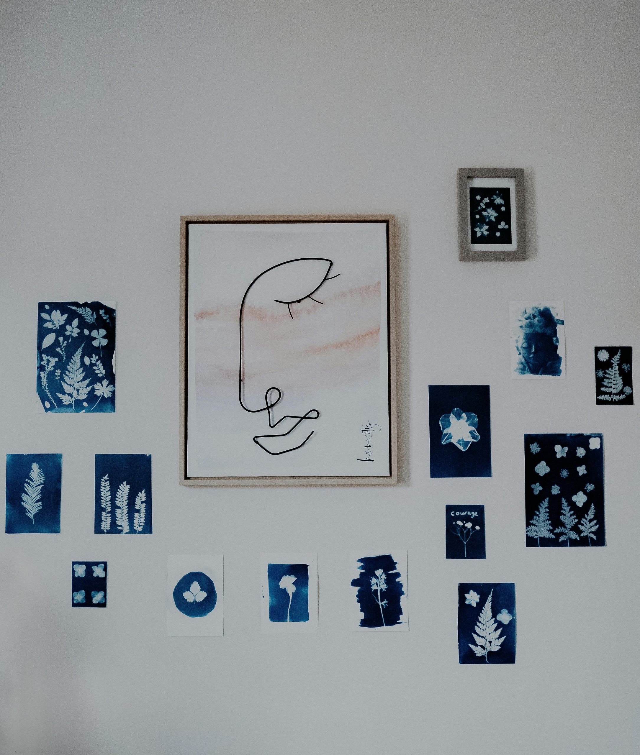
2. Organic Salon Style

This layout mixes frame sizes and orientations but maintains a clear visual balance. Start with a larger anchor piece slightly off center, then build around it with smaller works.
To keep it cohesive, limit your color palette and frame finishes. Too many competing tones can make the arrangement feel chaotic instead of curated.
3. Linear Arrangement

A linear gallery wall uses artwork aligned horizontally or vertically in a single line. This approach works beautifully in hallways, above beds, or along staircases. It elongates the space and provides rhythm without overwhelming the wall.
Frame Selection Matters More Than You Think
Frames act as the architecture of your gallery wall. The wrong frame can cheapen even high-quality artwork.
Stick to one or two finishes. Matte black offers contrast and sophistication. Natural wood adds warmth. Thin metallic frames bring lightness without heaviness. If mixing finishes, ensure they complement each other rather than compete.
Matting is equally important. White mats create breathing room and elevate smaller prints. Larger mats can make modest artwork feel more substantial.
Spacing and Installation
Spacing is where most gallery walls fail. Uneven gaps or inconsistent alignment disrupt visual flow.
As a general guideline:
- Maintain 2 to 3 inches between smaller frames
- Increase to 3 to 5 inches for larger arrangements
- Keep the center of the gallery wall approximately 57 to 60 inches from the floor, aligning with standard eye level
Use a level and measure carefully. Lay everything out on the floor first. For added precision, design tools like Canva can help you experiment digitally before installing.
For inspiration and layout ideas, Pinterest remains one of the most useful visual platforms when searching for gallery wall concepts.
Personal Style Versus Market Appeal
If you are designing for your own enjoyment, incorporate meaningful pieces. Family photographs, travel prints, and collected artwork add authenticity and character.
If you are preparing your home for sale, structure the gallery carefully, avoid making it too personal to you. Highly personal imagery can make it harder for buyers to envision themselves in the space. Neutral artwork, architectural prints, and landscapes tend to photograph better and appeal to a broader audience.
Thoughtful styling can significantly enhance how a property presents online. Combined with professional marketing and pricing strategy, small design details can influence how long a home stays on the market.
For buyers evaluating properties, visual presentation often signals how well a home has been maintained. We discuss how design choices influence buying decisions, check out our Home Buyers Guide.
Common Mistakes to Avoid
Even beautiful artwork can fall flat if installation lacks structure. Avoid these frequent issues:
- Hanging artwork too high above furniture
- Using too many frame finishes without a clear theme
- Ignoring proportion in relation to the wall size
- Filling every inch of space without allowing breathing room
Negative space is just as important as the art itself, but finding the right balance is important.
Final Thoughts
A gallery wall should feel intentional, and it should complement the architecture of the room, reflect your style, and maintain visual balance.
When done well, a gallery wall becomes more than decoration. It becomes part of the home’s identity. Whether you are refining your own space or preparing a property for market, thoughtful design decisions create stronger emotional connections.
Are you looking for more direction in building your home’s gallery wall? Reach out to our team today, and we can talk through your design ideas. In real estate, creating an emotional connection to the space makes all the difference!
This article is intended for informational purposes only and does not constitute legal advice. For legal interpretation of disclosure requirements, consult a qualified California real estate attorney.
Call The Stephen Haw Group at 310.503.9886 or email [email protected] for other local area tips and recommendations.